Elbow Method and Finding the Right Number of Clusters
Overview
We all know about clustering. Take some data, slap an algorithm on it, K-means, spectral clusterins, the list goes on and on, and then voila! We get some meaningful partition of our dataset. Except there is only one problem. How do we know how many clusters our data should have? This is a real problem for which there is no perfect solution. In this tutorial I will explain the folklore of the Elbow method and how to do this visually, and then present a more rigorous statistical method to determine the optimal number of clusters found in this paper.
Elbow Folklore
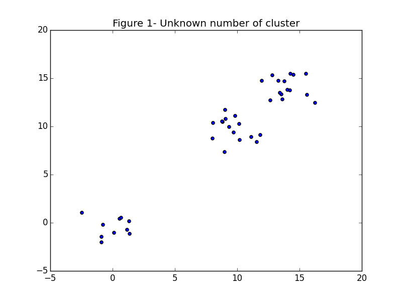
You can’t touch it with your tongue, and you can graph the average internal per cluster sum of squares distance vs the number of clusters to find a visual “elbow” which is the optimal number of clusters. The average internal sum of squares is the average distance between points inside of a cluster. Mathematically, \begin{align} W_k &= \sum_{r = 1}^k \frac{1}{n_r} D_r \end{align} Where \(k\) is the number of clusters, \(n_r\) is the number of points in cluster \(r\) and \(D_r\) is the sum of distances between all points in a cluster: \begin{align} D_r &= \sum_{i = 1}^{n_r - 1}\sum_{j = i}^{n_r} ||d_i - d_j||_2 \end{align} To see what I mean let’s take an example with three well separated clusters, and see what happens to the average internal sum of squares (\(W_k\)) as the number of clusters increases.
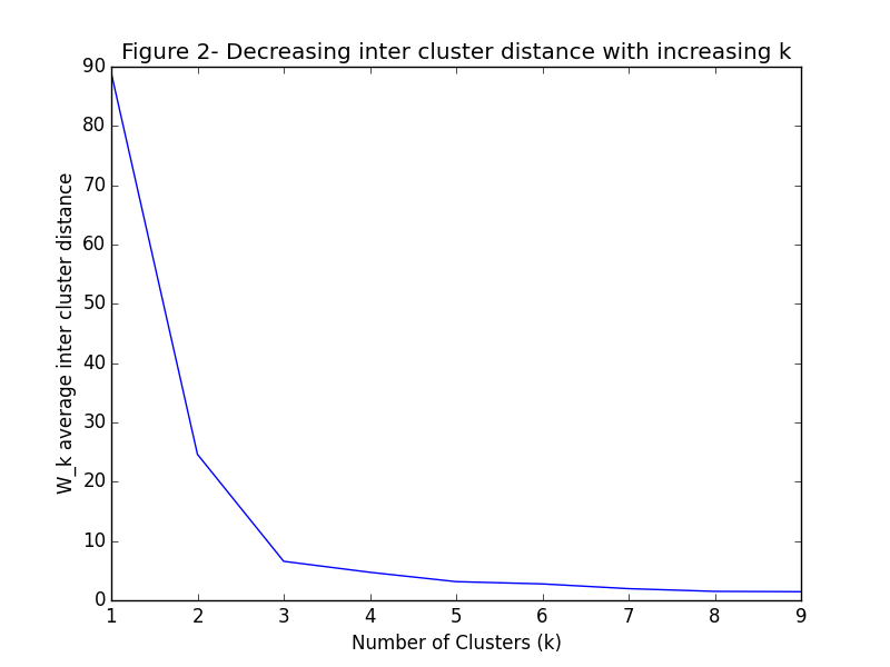
As you can see, at \(k=3\) the graph begins to flatten significantly. This point where the graph starts to smooth out is the prophesied “elbow” for which we have been looking.