Covariance and Visual Normality
Introduction
Recently I’ve been feeling the need to delve into statistics a bit more than I have in the past. I’ve always felt that a strong theoretical understanding of mathematics would be sufficient to excel at statistics. Unfortunately, I have come to realize that there is a great wealth of information in experience. I love playing with data, and teasing meaning from chaos. I plan to use the next few posts to begin looking at practical statistics in a bit more depth. This particular post steps through the basics of chapter one of Robert Gentleman, Kurt Hornik, and Giovanni Parmigiani’s book Multivariate analysis in R. Except here we are using Python, because I like python better. The first chapter concerns itself mostly with the concept of covariance. We will address the simple issue of calculating covariance and correlation, and then use these concepts to visually determine if a dataset is normally distributed.
For this discussion I will be using the abalone dataset found here. All analysis will be done in python.
Covariance
Covariance is a way of assessing how much two random variables depend on one another. It can be used to give us an idea of how the change in one variable could potentially affect the change in another. Covariance is defined as: \begin{align} \text{Cov}(X_i, X_j) = \mathbb{E}(X_i-\mu_i)(X_j - \mu_j) \end{align}
Where \(\mu_i = \mathbb{E}(X_i)\) and \(\mu_j = \mathbb{E}(X_j)\)
But there are many many ways to calculate covaraince which can be derived from the above equation such as:
\begin{align}
\text{Cov}(X,X) = \frac{1}{n}\sum_{i=1}^n (x_i-\bar{X_i})(x_i-\bar{X_i})^T
\end{align}
Where\(X_i\) are the rows of \(X\). This can be expressed more precisely as: [X^TX].
To begin Let’s take a look at our data using pandas. We load in the csv and then display the first five rows of our dataset.
import pandas as pd
import numpy as np
import scipy.stats as stats
import matplotlib.pyplot as plt

# Read in the CSV of the measure data
abalone = pd.read_csv("/Users/tetracycline/Data/abalone.csv")
abalone.head()| sex | length | diameter | height | whole_weight | shucked_weight | viscera_weight | shell_weight | rings | |
|---|---|---|---|---|---|---|---|---|---|
| 0 | M | 0.455 | 0.365 | 0.095 | 0.5140 | 0.2245 | 0.1010 | 0.150 | 15 |
| 1 | M | 0.350 | 0.265 | 0.090 | 0.2255 | 0.0995 | 0.0485 | 0.070 | 7 |
| 2 | F | 0.530 | 0.420 | 0.135 | 0.6770 | 0.2565 | 0.1415 | 0.210 | 9 |
| 3 | M | 0.440 | 0.365 | 0.125 | 0.5160 | 0.2155 | 0.1140 | 0.155 | 10 |
| 4 | I | 0.330 | 0.255 | 0.080 | 0.2050 | 0.0895 | 0.0395 | 0.055 | 7 |
So far so good. Now let’s use pandas to calculate the covariance of the data.
# To find covariance remove the categorical attribute gender
names = abalone.columns
abalone[names[0:]].cov() # Remove the categorical attribute sex| length | diameter | height | whole_weight | shucked_weight | viscera_weight | shell_weight | rings | |
|---|---|---|---|---|---|---|---|---|
| length | 0.014422 | 0.011761 | 0.004157 | 0.054491 | 0.023935 | 0.011887 | 0.015007 | 0.215562 |
| diameter | 0.011761 | 0.009849 | 0.003461 | 0.045038 | 0.019674 | 0.009787 | 0.012507 | 0.183872 |
| height | 0.004157 | 0.003461 | 0.001750 | 0.016803 | 0.007195 | 0.003660 | 0.004759 | 0.075179 |
| whole_weight | 0.054491 | 0.045038 | 0.016803 | 0.240481 | 0.105518 | 0.051946 | 0.065216 | 0.854409 |
| shucked_weight | 0.023935 | 0.019674 | 0.007195 | 0.105518 | 0.049268 | 0.022675 | 0.027271 | 0.301204 |
| viscera_weight | 0.011887 | 0.009787 | 0.003660 | 0.051946 | 0.022675 | 0.012015 | 0.013850 | 0.178057 |
| shell_weight | 0.015007 | 0.012507 | 0.004759 | 0.065216 | 0.027271 | 0.013850 | 0.019377 | 0.281663 |
| rings | 0.215562 | 0.183872 | 0.075179 | 0.854409 | 0.301204 | 0.178057 | 0.281663 | 10.395266 |
Something interesting to note is that the variance of each attribute lies on the diagonal of the covariance matrix. This is all fine and good but there is a real problem here. These covariances are hard to interpret because of the difference in scale between each of the features. Take for example the difference between length and rings. Rings has a maximum of 29 and length has a maximum of .8! A better way to examine these results is to look at what is known as correlation.
Correlation
Here we deal with the issue of scale by normalizing based on the standard deviation of each variable. The elements in our new matrix will be:
\begin{align} \rho_{ij} &= \frac{\sigma_{ij}}{\sigma_i\sigma_j} \end{align}
Correlation is much easier to interpret in that it describes a linear relationship between the variables of interest. If it is positive and large it indicates that if variable 1 is large then we might be able to expect variable 2 being large as well and vice-versa.
Let’s see what this looks like for our abalone dataset:
abalone[names[0:]].corr() # Remove the categorical attribute sex| length | diameter | height | whole_weight | shucked_weight | viscera_weight | shell_weight | rings | |
|---|---|---|---|---|---|---|---|---|
| length | 1.000000 | 0.986812 | 0.827554 | 0.925261 | 0.897914 | 0.903018 | 0.897706 | 0.556720 |
| diameter | 0.986812 | 1.000000 | 0.833684 | 0.925452 | 0.893162 | 0.899724 | 0.905330 | 0.574660 |
| height | 0.827554 | 0.833684 | 1.000000 | 0.819221 | 0.774972 | 0.798319 | 0.817338 | 0.557467 |
| whole_weight | 0.925261 | 0.925452 | 0.819221 | 1.000000 | 0.969405 | 0.966375 | 0.955355 | 0.540390 |
| shucked_weight | 0.897914 | 0.893162 | 0.774972 | 0.969405 | 1.000000 | 0.931961 | 0.882617 | 0.420884 |
| viscera_weight | 0.903018 | 0.899724 | 0.798319 | 0.966375 | 0.931961 | 1.000000 | 0.907656 | 0.503819 |
| shell_weight | 0.897706 | 0.905330 | 0.817338 | 0.955355 | 0.882617 | 0.907656 | 1.000000 | 0.627574 |
| rings | 0.556720 | 0.574660 | 0.557467 | 0.540390 | 0.420884 | 0.503819 | 0.627574 | 1.000000 |
From the above table it appears that most things have a positive relationship meaning that if one of the features increases it could be expected that the other will be larger as well. This makes sense given that most of the data is physical and size based. Take a look at the diameter row. Here wee see that the feature that has the most correlation with diameter is length. This makes sense given that abalone are mostly round so length and diameter should behave very similarly.
Distribution Testing
So this is all fine and good butcan we do something more interesting with this like determine if the features of the abalone are normally distributed? To answer this question we will use the visual tool of a quantile-quantile plot. This tool shows the
For example let’s see if points drawn from a normal distribution match a theoretical normal distribution.
# Create a quantile-quantile plot of normal data
normal_data = np.random.normal(loc = 20, scale = 5, size=100)
stats.probplot(normal_data, dist="norm", plot=plt)
plt.show()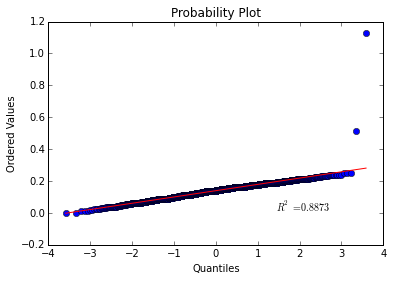
Would you look at that, almost perfectly linear! This shows that our points were most likely drawn from a normal distribution so our sanity check passed!
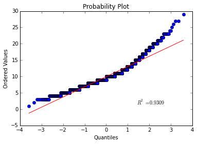
Now let’s try this with the height feature of the abalone data.
# Create a quantile-quantile plot of normal data
stats.probplot(abalone["height", dist="norm", plot=plt)
plt.show()
The curve is exceptionally linear! Except for a few troublesome outliers.
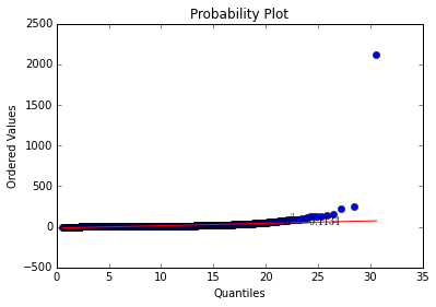
What about the rings feature:
This curve deviates quite a bit from linear so I would be hesitant to conclude that the abalone’s rings are normally distributed.
What about the whole abalone? Are the features collectively drawn from a multivariate normal distribution? This may appear like a much trickier question but in actuality it is quite easy to determine. All we need to do is examine the Mahalanobis distance between the points and then compare to the \(\chi^2_q\) distribution. If we do that we get:
means = abalone[names[1:]].mean(axis=0)
S = abalone[names[1:]].cov()
x = abalone[names[1:]].as_matrix() - means.as_matrix()
d = np.dot(np.dot(x, np.linalg.inv(S)), x.transpose())

# Compare to a chi square with 3 degrees of freedom.
stats.probplot(np.diag(d), dist=stats.chi2, sparams=(8,), plot=plt)
plt.show()