Introduciton to PCA and its relationship to SVD
Introduction
I was playing around with PCA the other day and thought that I’d make a quick post about it. This post will try to help you see what happens to the data geometrically. I will step through working with the data in 2D so we can see how the points move around in space, next I will draw a connection to the SVD, and finally I will apply the method to a real dataset.
PCA
PCA stands for Principle Component Analysis. It is a very powerful technique that is capable of reducing the dimensionality of the dataset. This can be very useful for visualizing high dimensional datasets, though if this is your end goal I would make sure to check out t-sne. But more importantly it helps us project our data onto an “optimal” subspace, what I mean by optimal is that this new subspace captures the major axes of variation in the data.
Let’s generate some data from a skewed gaussian in 2-dimensions. We can think of the rows of this matrix as data points and the columns as the features that we have examined for each point.
mean = [0, 0]
cov = [[10, 0], [40, 50]]
data = np.random.multivariate_normal(mean, cov, 5000)
plt.plot(data[:, 0], data[:,1], 'ko')
plt.axis('equal')
plt.show()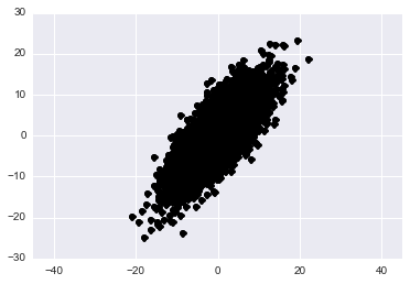
(Aside) If you’re unfamiliar with how the covariance matrix affects the geometry of your distribution please play around with the above code and change the values in the cov variable. See what you can learn.
Back to the topic at hand, the principle components of a matrix are the eigenvectors of its normalized covariance matrix. Now keep in mind that there are two different ways that we can look at covariance. Either the covariance accross features or the covariance accross rows. It depends on the application and what you are interested in. For example if you’re doing facial recognition using eigenfaces then you’d be interested in the variation accross pixels and if the matrix of faces contains one face per column then we would take \(XX^T\) and examine its eigenvectors and eigenvalues. If we are interested in the variation accross the columns, as we are in this case because they hold our features, then our covariance matrix becomes \(X^TX\).
\begin{align} X^TX &= WLW^T \end{align}
Let’s do this quickly by hand and then use sklearn’s built in method.
1) Find the mean of each column and subtract it from all values in that column. This normalizes the data so that it has 0 mean.
# Normalize the columns of our data
data_mat = np.matrix(data)
for column in range(0, data_mat.shape[1]):
     data_mat[:, column] = data_mat[:, column] - np.mean(data_mat[:, column])
Just to check let’s make sure that each columns does indeed have 0 mean.
print np.mean(data_mat[:,0])
print np.mean(data_mat[:,1])
-9.66338120634e-17 -1.25055521494e-16
Yes they do so we are good to proceed.
2) Compute the column covariance matrix.
# Compute column covariance matrix
cov_mat = np.dot(np.transpose(data_mat), data_mat)
3) Compute the eigen decomposition of the normalized covariance matrix
# Compute the eigen decompostion
L, W = np.linalg.eig(cov_mat)
4) We are finished!
Now we know that the principle components lie in the columns of W. At the beginning of the post I mentioned how these principle components represent the axes of maximal variation in the data. We can plot these new axes in 2D as:
\begin{align} y = \frac{W_{00}}{W_{10}} (x - \mu_1) + \mu_2 \end{align}
Where \(\mu\) is the mean of the subscripted column.
# Plot the axes of the principle components
comp = data_pca.components_
mean = data_pca.mean_
limits = 30
axis1 = W[0,0] / W[1,0]*(np.linspace(-limits, limits, 1000) - mean[0]) + mean[1]
axis2 = W[0,1] / W[1,1]*(np.linspace(-limits, limits, 1000) - mean[0]) + mean[1]
plt.plot(data[:, 0], data[:,1], 'ko')
plt.plot(axis1,np.linspace(-limits, limits, 1000), 'r-')
plt.plot(axis2,np.linspace(-limits, limits, 1000), 'r-')
plt.axis('equal')
plt.show()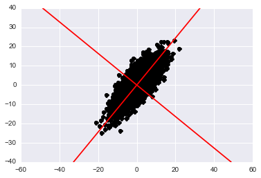
We can use these principle components to plot our data in this new space by projecting each data point onto it:
\begin{align} \tilde{x} &= W^TX^T \end{align}
Before scrolling down think for a moment about what you’d expect to see when projecting onto this new space. In the normal x-y plane we see a skewed gaussian that is elliptical. If we scale and rotate our axes and then project into this space what shape should the data appear?
y = np.dot(W.transpose(), np.transpose(data_mat)).transpose()
plt.plot(y[:,0], y[:,1], 'ko')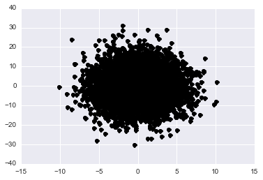
Now that we’ve gone through the basic mechanics of performing PCA. I’d like to mention two more things before proceeding to a real world example. First, that sklearn has a nice package that does this for us:
data_pca = PCA(n_components=2)
data_pca.fit(data)
S = data_pca.components_
We find that: \begin{align} S = [[-0.63095923 -0.77581599] [-0.77581599 0.63095923]] \end{align}
Which is the transpose of the same thing that we found using the eigendecomposition. Also notice that the columns are shuffled. In PCA we order the columns of W in decending order of importance based on the associated eigenvalue. We did not do this in the above example because we were not reducing the dimensionality only demonstrating what it looks like geometrically. The method in sklearn does this ordering for you such that the first columns of \(S^T\) has the most important eigenvector.
The second thing that I wanted to touch on briefely was the relationship between PCA and SVD. If you noticed in PCA we took the eigenvalue decomposition of the covariance matrix. If you recall from Linear algebra when constructing the SVD we generate the left eigenvectors from \(XX^T\) and the right eigenvectors from \(X^TX\) using the eigendecomposition. I’ll quickly show this below for both sides.
\begin{align} X^TX &= WLW^T && \text{PCA}\newline &= (U\Sigma V^T)^T(U\Sigma V^T) && X = U\Sigma V^T \text{def: SVD}\newline &= (V\Sigma U)(U\Sigma V^T) && \text{Apply Transpose}\newline &= V\Sigma^2V^T && \text{Orthogonality of }U \end{align}
You can do this same analysis for \(XX^T\) and see that the principle componenets would lie in \(U\). Let’s test this in python.
U, S, V = np.linalg.svd(data_mat, full_matrices=False)
print V
And we get:
matrix([[-0.63095923, -0.77581599], [-0.77581599, 0.63095923]])
Which is the same as using sklearn, and calculating PCA by hand!
Now why might we want to use the SVD instead of PCA, well if we want to characterize the column and row variance simultaneously then we could use SVD, or if we are worried about numerical stability of our solution SVD is a better because we do not need to calculate the covariance matrx directly. Generally I recommend using SVD to prevent numeric error. To see this let’s look at the unstable matrix below:
\begin{align} \begin{bmatrix} 1 & 1 & 1\newline \epsilon & 0 & 0\newline 0 & \epsilon & 0\newline 0 & 0 & \epsilon \end{bmatrix} \end{align}
epsilon = 1e-8
mat = np.matrix([[1,1,1],[epsilon,0,0],[0,epsilon,0],[0, 0, epsilon]])
U, S, V = np.linalg.svd(mat, full_matrices=False)
print V

cov_mat = np.dot(np.transpose(mat), mat)
L, W = np.linalg.eig(cov_mat)
print W.transpose()
[[-0.57735027 -0.57735027 -0.57735027] [ 0. -0.70710678 0.70710678] [-0.81649658 0.40824829 0.40824829]]
[[ 5.77350269e-01 5.77350269e-01 5.77350269e-01] [ -6.51147040e-17 -7.07106781e-01 7.07106781e-01] [ 6.09781659e-01 -7.75129861e-01 1.65348202e-01]]
You’ll notice that the last vector differs significantly between the two methods due to the unstable covariance matrix calculation.
Real Applications of PCA
All right, let’s applly some of the stuff that we’ve learned to a real dataset. I will be analyzing the air pollution data found here. These data give air pollution in terms of \(SO_2\) for 41 U.S. cities. To start our analysis let’s begin by visualizing the data in a scatterplot matrix jus to get a feel for what is going on.
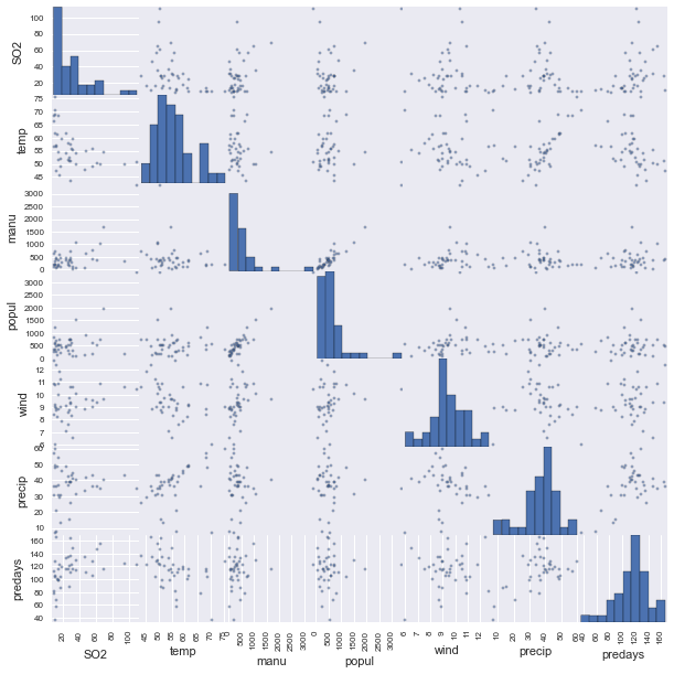
What stands out right away to mee is that it appears that manufacturing and population are definitely correlated as are temperature and precipitation. We also see that there are clearly some outliers. Notice in manufacturing especially. For now we will ignore the outlier problem but it might be beneficial in the future to remove them.
Next I take a quick look at the correlation matrix to confirm the observations from the scatterplots.
| SO2 | temp | manu | popul | wind | precip | predays | |
|---|---|---|---|---|---|---|---|
| SO2 | 1.000000 | -0.433600 | 0.644769 | 0.493780 | 0.094690 | 0.054294 | 0.369564 |
| temp | -0.433600 | 1.000000 | -0.190042 | -0.062678 | -0.349740 | 0.386253 | -0.430242 |
| manu | 0.644769 | -0.190042 | 1.000000 | 0.955269 | 0.237947 | -0.032417 | 0.131829 |
| popul | 0.493780 | -0.062678 | 0.955269 | 1.000000 | 0.212644 | -0.026119 | 0.042083 |
| wind | 0.094690 | -0.349740 | 0.237947 | 0.212644 | 1.000000 | -0.012994 | 0.164106 |
| precip | 0.054294 | 0.386253 | -0.032417 | -0.026119 | -0.012994 | 1.000000 | 0.496097 |
| predays | 0.369564 | -0.430242 | 0.131829 | 0.042083 | 0.164106 | 0.496097 | 1.000000 |
We see taht indeed manufacturing and poppulation are strongly correlated .995 and temperature and precipitation appear somewhat weakly correlated. We see also that temperature and window are negatively correlated which is interesting as well. But enough of just exploration let’s use some of these principle components to understand our data better.
# Load in the Data
air = pd.read_csv("../Data/usair.csv")

# Convert to matrix
air_mat = air[air.columns[2:]].as_matrix()

# Find and subtract off the mean
for column in range(0, air_mat.shape[1]):
     air_mat[:, column] = air_mat[:, column] - np.mean(air_mat[:, column])

U, S, V = np.linalg.svd(air_mat, full_matrices=False)
print V
print S / np.sum(S)
We see immediately that the majority of the variation is accounted for by one Prinicple Component. Now this could very well be the case but when this happens I like to check my matrix. This could be real or it could be caused by differences in feature scales. Let’s check the maximum value for each feature.
for column in range(0, air_mat.shape[1]):
     print np.max(air_mat[:, column])
19.7365853659 2880.90243902 2760.3902439 3.25609756098 23.0309756098 52.0975609756
As we can see the manufacturing feature is 2-3 orders of magnitude larger than the other features. Now there are a few ways of fixing this we can normalize all of the features or perform PCA on the correlation matrix instead. I’m going to go with the later.
# Do PCA on the correlation matrix because of the non normalized values
air_corr_mat = pd.DataFrame(air_mat).corr().as_matrix() # This is dumb I know that
L, W = np.linalg.eig(air_corr_mat)
print W
print L / np.sum(L)
[[-0.32964613 0.55805638 0.1361878 -0.30645728 0.67168611 -0.1275974 ] [ 0.61154243 -0.10204211 0.70297051 0.13684076 0.27288633 -0.16805772] [ 0.57782195 0.07806551 -0.69464131 0.07248126 0.35037413 -0.22245325] [ 0.35383877 0.11326688 0.02452501 -0.86942583 -0.29725334 0.13079154] [-0.04080701 -0.56818342 -0.06062222 -0.17114826 0.50456294 0.62285781] [ 0.23791593 0.58000387 0.02196062 0.31130693 -0.09308852 0.70776534]]
[ 0.36602711 0.01909511 0.00574121 0.12670448 0.23244152 0.24999057]
Voilla! Now our patterns are a bit more spread out notice that columns 0, 4, and 5 now represent about 80% of our data instead of just one principle component. This seems more reasonable given this dataset! Now for a note on interpreting these matrices. Each row of \(W\) represents a different feature and each column is the principle component. We see that the first column accounts for about 36% of the variation and is our most important principle component, but how can we interpret it? Well qualitatively it looks like the largest values in this column are associated with manufacturing and population, so this component might represent the human factors. If we look at component 5 the next most important we see that it is most strongly associated with precipitation and predays. So this could be considered to be a rain factor. The last important component 4 appears to be related to precipitation and temperature.
A word of warning though, this qualitative analysis above is mostly opinion, and small bits of noise in the data could vastly change these reasonings. One should always be cautious when trying to interpret the “meaning” of the principle components. For this example though, because it is cherry picked, this makes sense.
To conclude if you were interested in clustering your data or finding low dimensional patterns you could then visualize the data in the lower dimensional space. Or if you were interested in predicting \(SO_2\) levels you could regress on the Principal Components. The nice thing about regressing on the principle components as opposed to the original dataset is that it is the same as performing \(k\) simple linear regressions because all of the features are orthogonal. Let’s try this quickly and see if we can predict \(SO_2\) levels based on the principle components.
# Take the 5 most important singular values
W_top = W[:, [0,4,5,3,1]]

# project the data
air_projected = np.dot(W_top.transpose(), np.transpose(air_mat)).transpose()

# Regress on the projected data
regr = linear_model.LinearRegression()
regr.fit(air_proj[:], air["SO2"])

# Calculate the residuals
predictions = regr.predict(air_proj)
residuals = air["SO2"] - predictions

# Examine some properties of the residuals
print np.max("max: ", residuals)
print np.min("min: ", residuals)
print np.median("med: ", residuals)

# Calculate the Residual Standard Error
np.sqrt(np.dot(np.matrix([residuals_original]),np.matrix([residuals_original]).T)/34)
Here we find a model with residual standard error of 14.6.
Now It is important to note that if you use all of the principle components then your regression analysis will be identical to that of regressing on the original dataset. If you repeat the above experiment with the full \(W\) matrix you will get the same thing as regressing on the original data. I leave the examination of the residuals to the reader.