Data Maps the best ML debugging tool you’ve never heard of.

Introduction
I see far too many data scientists guessing at what to do next to improve their models. When asked how to improve a system that isn’t performing adequately I usually get vague answers like “collect more data” or “Try a different model.” That’s fine but it’s like responding to the question “How do you debug this error?” With “Use print statements.” It ignores the actual “how” and the real thought process behind improving the system.
Rant aside a paper by Pedro Domingos a few years ago had a really large impact on my thinking. In this he argues that effectively all models that are learned with gradient descent are kernel machines. A hand wavey way to think about this is 👋 that all deep learning models effectively learn some similarity function over seen data. Or put another way, the model “memorizes” the data and can find the closest seen point. I’m glossing over a lot here but the intuition is that the model IS the data to some extent and that means that improving your data is a very ripe field for improving your models outcome. 👋 A technique I’ve been using a lot lately to great success is the Data Map. This technique can help you determine which data your model is learning the most from and focus your efforts there. It’s a really powerful model debugging technique that we all need to know about.
In this tutorial we’ll go through the main ideas, and implement a few functions which allow us to calculate them for some simple models. We’ll, visualize the results and talk about how we can apply them.
Don’t debug by guessing! Use a DataMap! All code for this tutorial is available in a Colab Notebook.
Appeal to Reader
If you pay for Medium, or haven’t used your free articles for this month, please consider reading this article there. I post all of my articles here for free so everyone can access them, but I also like beer and Medium is a good way to collect some beer money : ). So please consider buying me a beer by reading this article on Medium.
Big Idea
When you’re trying to learn something new, let’s say a new math concept from a textbook, do you get the most bang for your buck from doing the easy examples that you can churn out without thinking? What about the hard examples that are beyond your comprehension? Neither really, at least for me, I learn best when I focus on the problems that are challenging but just at the edge of my understanding. Data Maps are a method of uncovering those boundary examples which allows you to more efficiently improve your models performance.
Let’s take a look at the visualization example from the original paper to get a sense of what we’ll be building today.
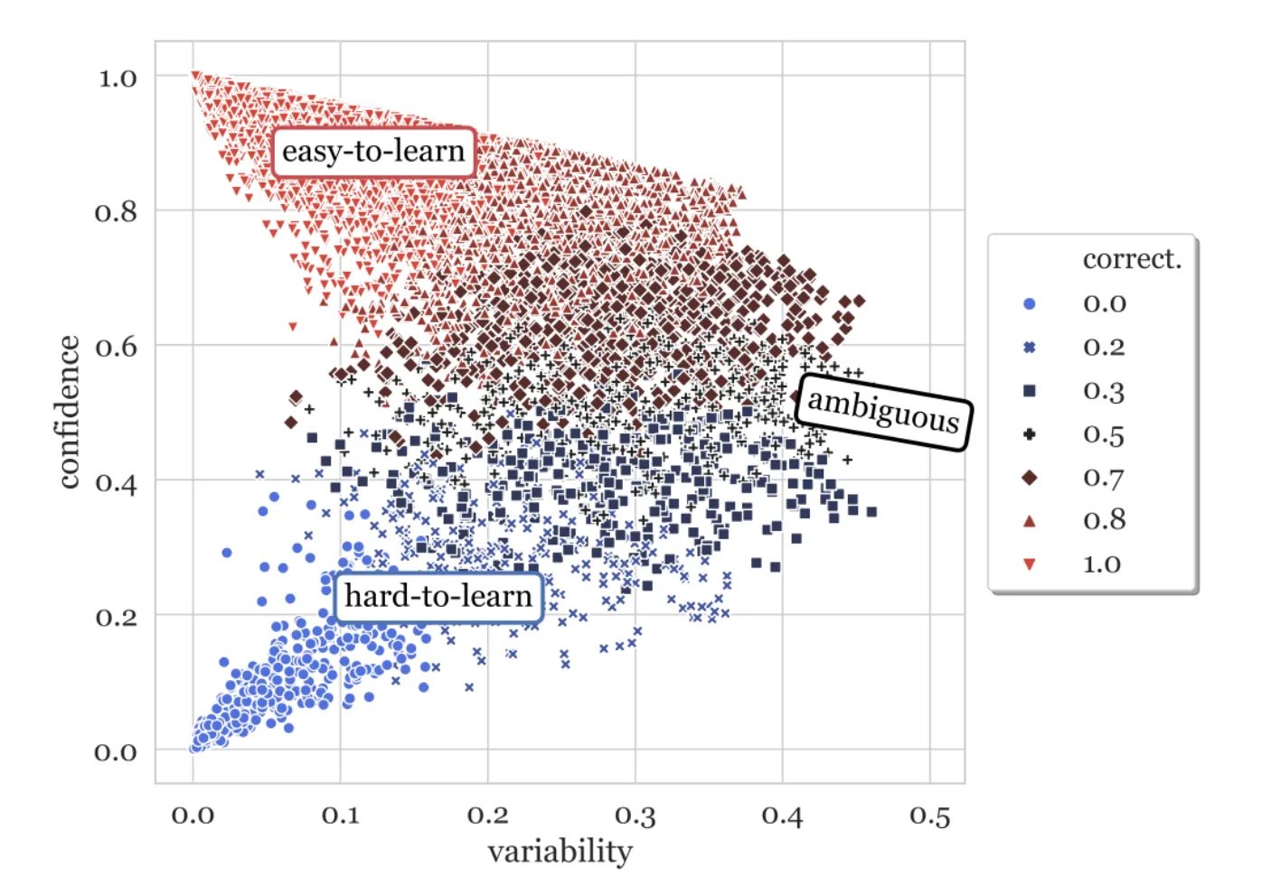
In this plot each point represents a datapoint in our training dataset over the training epochs. It’s a three dimensional plot of three different metrics that describe how the model’s prediction of that particular data point changes during training. These metrics are correctness (color), confidence(y-axis), and variability (x-axis).
correctness
This metric describes how often during training did the model correctly predict the class of this data point. Imagine you’re training the IMDB movie review dataset for 10 epochs. One of the data points in the training set is the review (“I really loved this movie!”, 1). Correctness is the number of epochs where the model predicted that this review was positive divided by the number of epochs where it predicted it was negative. It’s the number of times the model correctly predicted the data point correctly divided by the total number of epochs. As an equation it looks like the following:

This one metric is already kind of useful on its own. If you have a large dataset and want to understand which data points the model is struggling with you can look at the data points that are 50% correct. You could then further explore how the model learns them. Does the model initially get them correct after the first one to two epochs and then start miss predicting? Does it get them correct randomly? Does it get them wrong initially and then start getting them right toward the end? Each of these tells you something about the data and how the model is learning in relationship to these points. I’ve plotted the behavior of three hypothetical data points from training a model following these trends. What do these plots tell you?
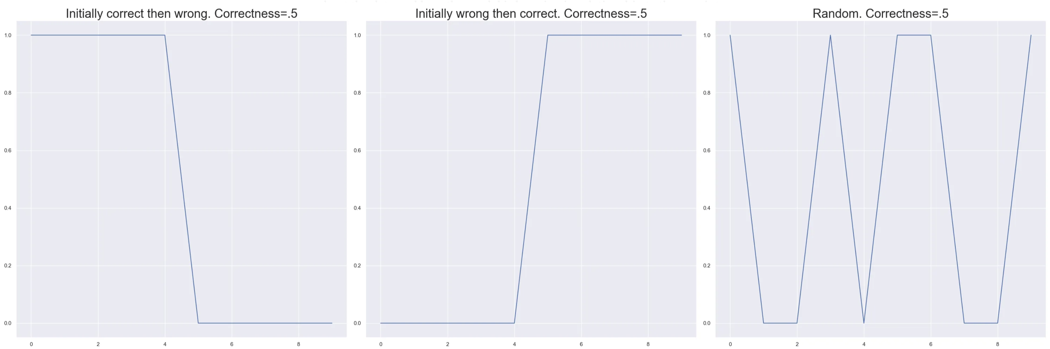
Even though these three situations have the same correctness they tell us vastly different things about the data point. In the first case we are seeing some kind of overfitting. The model learns the data point and then forgets about it later. In the second we have normal expected learning, it didn’t know how to solve the problem and later it figures it out. The last shows that the model is clearly confused, the point might lie on a boundary. To understand what is really happening we’ll need to explore the other two metrics.
confidence
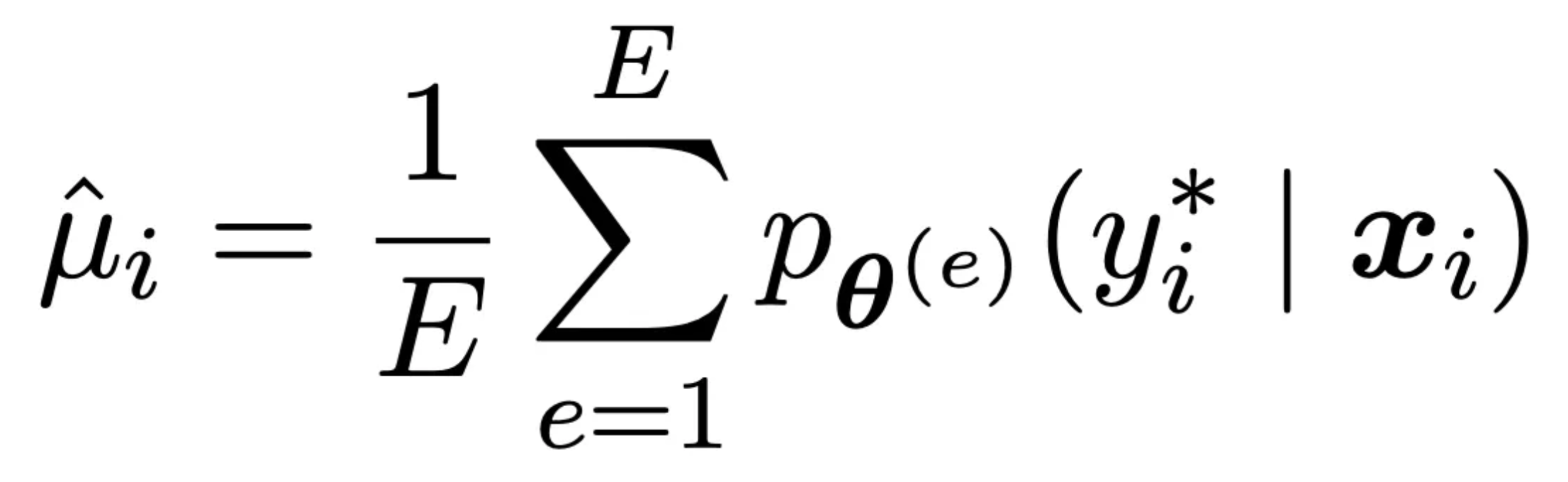
Confidence measures on average how sure of a prediction the model is. It is calculated by averaging the predicted probability of the true class over all epochs. Take the same data point above and imagine that it’s correctness was 80% so in 10 epochs it correctly predicted it 8 / 10 times. This smells like the model really understands this data point. What if of those eight correct predictions the model output a probability of .5000000001 and the other two incorrect ones it output .45? That would indicate that this point is still on the boundary of the models understanding. It’s getting it right, but not by much. These examples can be really helpful in understanding what the model gets but just barely and when combined with correctness helps us understand the degree of understanding about the predictions the model is making. Formally it is defined as follows where e are examples. and the p term is the probability of the correct class for the data point e again it’s just an average.
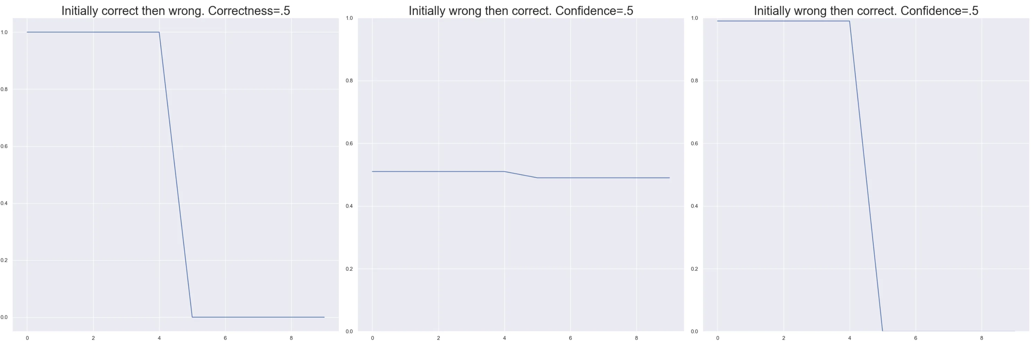
Let’s explore some of the correctness results from above in the light of confidence.
If we look at the first case where the model forgets. It’s very different if the confidence changes by a little or by a lot. Imagine data that switches from .51 to .49 as in the middle case as opposed to switching from .99 to 0 as in the second case. In one the model catestrophically forgot. In the other it’s a boundary point that is slightly less confident than it used to be.
variability
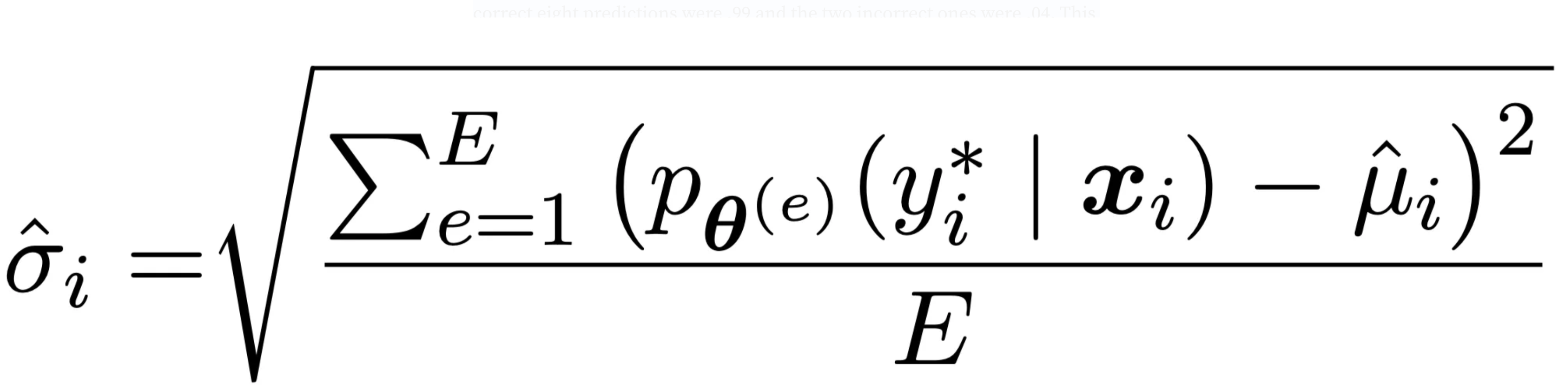
The last measure in this plot is variability. This is the standard deviation of the predicted probability of the true class over the epochs. It tells us how much the model’s estimation of a point swings over the course of training. Let’s take our same example from above and imagine that we have a correctness of 70% with a confidence of .8. So the model is pretty confident in it’s predictions for the most part and mostly correct. However if the correct eight predictions were .99 and the two incorrect ones were .04. This data point might be less stable than we thought and worth looking into. It is defined as follows. It is just the standard deviation of the true value of the point.
Let’s apply this to a real DataSet
We’re going to be working with the go_emotions dataset. The goal is to classify small spans of text as emotions. In this example we will predict gratitude only. The whole dataset contains more labels but for the sake of simplicity we’re going to stick to only one. The outline of what we need to do is:
-
Load our data
-
Create a simple classifier using sklearn’s SGDClassifier
-
Use the partial fit method to fit a single epoch at a time
-
Label each datapoint in every epoch and store those in a list.
-
Calculate the variability, correctness, and confidence of every point.
It’s not too complicated!
1. Load in the data 💾
In the below snippet we load in our packages and create our training and test set. We also create a label column that represent whether or not a particular piece of text expresses gratitude.
from sklearn import pipeline
from sklearn.feature_extraction.text import TfidfVectorizer
from sklearn.linear_model import SGDClassifier
from sklearn.compose import ColumnTransformer
from sklearn.metrics import classification_report
from sklearn.utils.class_weight import compute_class_weight
from datasets import load_dataset
import pandas as pd
import torch

# Load in the dataset from huggingface
dataset_ls = load_dataset("go_emotions",  split=['train', 'validation'])
LABEL = "gratitude"

# Create a list to map the integer class value to a human readable name
label_names = ['admiration', 'amusement', 'anger', 'annoyance',
       'approval', 'caring', 'confusion', 'curiosity', 'desire',
       'disappointment', 'disapproval', 'disgust', 'embarrassment',
       'excitement', 'fear', 'gratitude', 'grief', 'joy', 'love',
       'nervousness', 'optimism', 'pride', 'realization', 'relief', 'remorse',
       'sadness', 'surprise', 'neutral']

# Create a map to go from name to index.
label_index_map = {n: i for i, n in enumerate(label_names)}

# Create dataframes for the train and test set, als create a label column so we do binary prediction
# insted of multilabel prediction.
train_df = dataset_ls[0].to_pandas()
train_df["label"] = train_df["labels"].apply(lambda x: any([label_names[y] == LABEL for y in x]))


test_df = dataset_ls[1].to_pandas()
test_df["label"] = test_df["labels"].apply(lambda x: any([label_names[y] == LABEL for y in x]))
Looking at some examples of gratitude from the dataset:
‘Thank you friend’, ‘Super, thanks’, ‘aw, thanks! I appreciate that! ‘, ‘Thanks! I love watching him every week’
Those match my intuition of what gratitude looks like.
Create the model 🤖
Next we create our SGDClassifier (more on this later). Our model will use 1–3 grams with TF-IDF. We set a few parameters on the SGDClassifier to have closer parity with Sklearn’s LogisticRegression Classifier.
# Extract the text column from the dataframe and fit a tfidfvectorizer to it
ct = ColumnTransformer([('tfidf', TfidfVectorizer(ngram_range=(1, 3)), 'text')])

# We balance our classees for better training performance and convergence.
class_weights = {k: v for k, v in zip([0, 1], compute_class_weight("balanced", classes=[False, True], y=train_df["label"]))}

# Create the estimator using the SGDClassifier. We set the parameters here
# to match the defaults for logisticregression.
estimator = SGDClassifier(loss="log_loss",
                        penalty="l2",
                        fit_intercept=True,
                        class_weight=class_weights,
                        random_state=1234,
                        early_stopping=False)
# Fit the tfidf vectorizer
train_features = ct.fit_transform(train_df)
(3/4) Train the model and fit on each datapoint 📚
Now we need to run training one epoch at a time. This is why we chose the SGDClassifier. All we need to do is run partial_fit in a for loop. While doing this we’ll predict the probability for each training example after each epoch. That’s it! Pretty simple
n_epochs = 10
data_maps = []
# Step through all of the data 10 times.
for epoch in range(n_epochs):
    # Use the partial fit method to train only on one epoch's worth of data
    estimator.partial_fit(train_features, train_df["label"], classes=[0, 1])

    # Predict the probability of each data point being gratitude.
    data_maps.append(estimator.predict_proba(train_features))
Our data_maps list can be thought of as a three dimensional tensor with the dimensions [epoch, data, class] and the values as the predicted probabilities.
5. Create the Data Maps!
The first step is to calculate the confidence, variability, and correctness of the points. The main piece of computation here is to calculate the predicted probability of the true class at each point in time, then assess the mean, std, and percent correct. The math is pretty straightforward once you have the data in the right form.
def calculate_confidence_variability_correctness(
    probabilities: torch.Tensor, y_true: torch.Tensor, multilabel: bool = False
) -> Tuple[torch.tensor, torch.tensor, torch.tensor]
    """Calculate confidence, variability, and correctness from a datamap.

    The datamap is a tensor of probabilities with shape
    [n_epochs, n_examples, n_labels], and the true labels are provided as
    y_true, either as a list of ones and zeros for binary classification or a
    list of integer indexes for multiclass classification. Set the multilabel
    parameter to True for multilabel classification.

    The output includes the mean model probability of the true label across epochs
    (confidence), the standard deviation of the true label probability across epochs
    (variability), and the percentage of times the model correctly predicted this
    data point at a threshold of 0.5 (correctness).

    :param probabilities: The probabilities as a tensor of size [n_epochs, n_examples, n_labels].
    :param y_true: The true label indexes. If binary a list of ones and zeros of
        dimension n_examples.  If multiclass a list of integer indexes.
    :param multilabel: The boolean determining multiclass or multilabel set of statistics.
    :return:
        All values are returned where the rowsa are epochs and columns are examples.
        confidence: The mean model probability of the true label across epochs.
        variability: The standard deviation of true label probability across epochs.
        correctness: The percent of times the model correctly predicted this data point
            at .5 threshold.
    """
    n_epochs, n_examples, n_labels = probabilities.shape

    # Calculate probabilities for true labels. If we are in a multiclass setting then
    # we might have 0,1,2 as labels. the probability of not label 1 is 1 - p(1).
    # So we need to calculate the probability of the true label in the negative case
    # as 1-p(1).
    if multilabel:
        # Multilabel case
        true_probs = []
        for i in range(n_labels):
            # Use y_true as a binary mask to get the probabilities for the true label
            true_probs = (y_true * probabilities).transpose(1, 2)

            # Get all of the probabilities for the zero label.  These probabilities
            # should be 1 -  themselves because the model is returning the probability
            # of the 1 class and we want the probability of the null class.
            null_probs = 1 - y_true.logical_not() * probabilities
            null_probs = null_probs * (null_probs != 1)

            # Combine the null probabiliites and the 1 probabilities
            true_probs = true_probs + null_probs.transpose(1, 2)
    else:
        # We need to expand the true labels to match the shape of the probabilities
        # Gather let's us extract the probabilities for the true label be it 0 or 1.
        # These probabilities do not necessarily add to one because they are proxies
        # from a model.
        true_probs = torch.gather(
            probabilities, 2, y_true.repeat(n_epochs, 1).unsqueeze(dim=2)
        ).squeeze()

    # Calculate statistics over epochs. Each row is an epoch and each column is
    # an example.  In the multilabel case the tensor is of shape
    # [epochs, examples, labels]
    confidence = true_probs.mean(dim=0).tolist()
    variability = true_probs.std(dim=0).tolist()
    correctness = ((true_probs >= 0.5).sum(dim=0) / n_epochs).tolist()

    return confidence, variability, correctness
Now that we have a vector for each of our computed values putting them into a DataFrame makes it easy to see what’s going on and visualize the results. Each element in the vectors is index aligned to our original train_df . We can use the following snippet to stack these columns together to form our data map DataFrame.
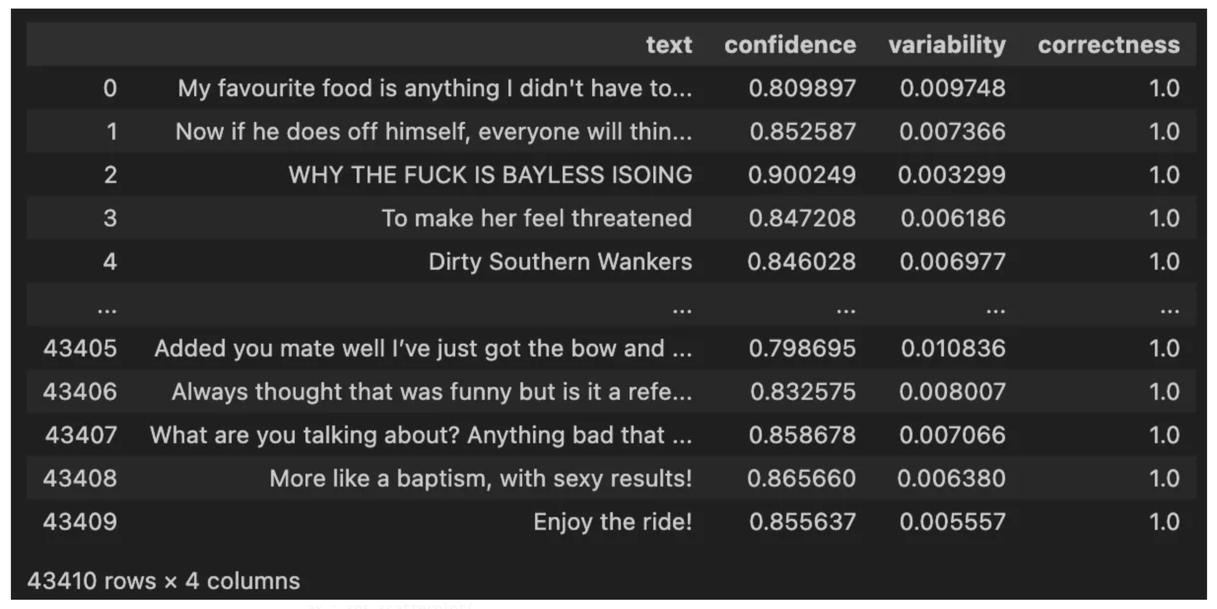
data_map_df = pd.DataFrame(
    zip(
        train_df["text"].tolist(),
        confidence[i],
        variability[i],
        [round(x, 2) for x in correctness[i]],
    ),
    columns=["text", "confidence", "variability", "correctness"],
)
Visualizing the DataMaps
The DataFrame we created makes it super simple to create a colored scatter plot of the values we care about.
import matplotlib.pyplot as plt
import seaborn as sns
sns.set()

data_map_df["correctness"] = data_map_df["correctness"].apply(lambda x: float(x))
ax = sns.scatterplot(
    x="variability",
    y="confidence",
    style="correctness",
    data=data_map_df,
    hue="correctness",
    legend="full"
)
ax.set_title(f"Data Map for {LABEL}")
plt.show()
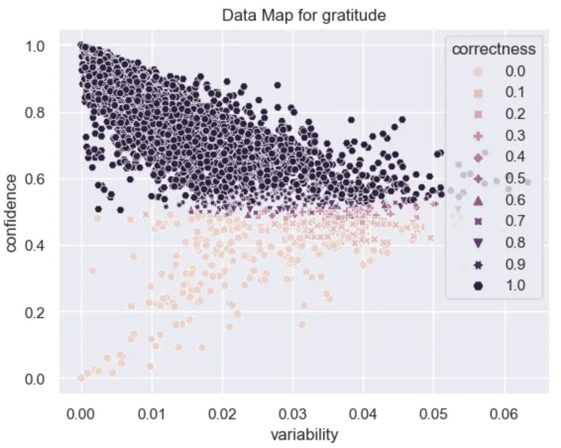
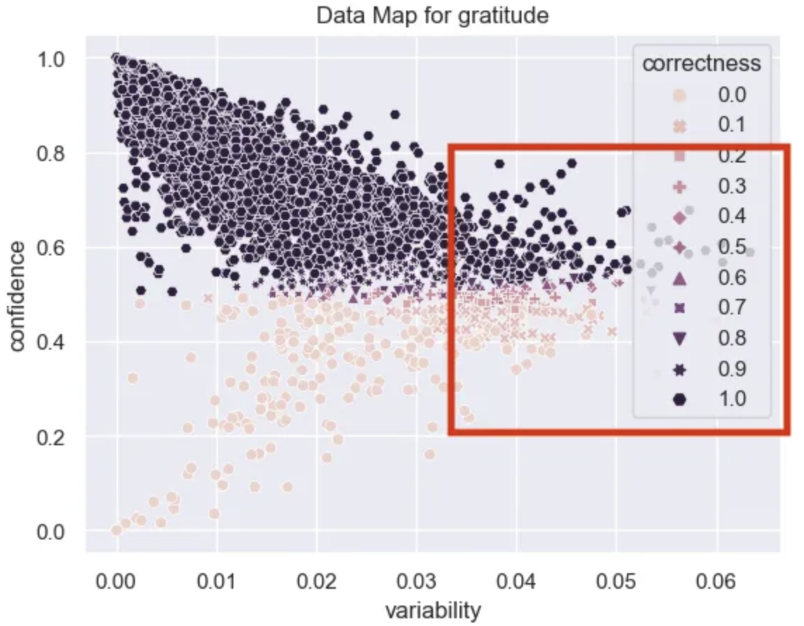
With this plot we can start to understand our data at a deeper level. From the variability axis we can see that the model converges quickly and the probabilities of the datapoints don’t change all that much as training progresses. This is probably due to the fact that this is a fairly simple problem.
Easy Examples
It looks like there are A LOT of examples that are very easy for the model to learn. These have high confidence, high correctness, and low variability.
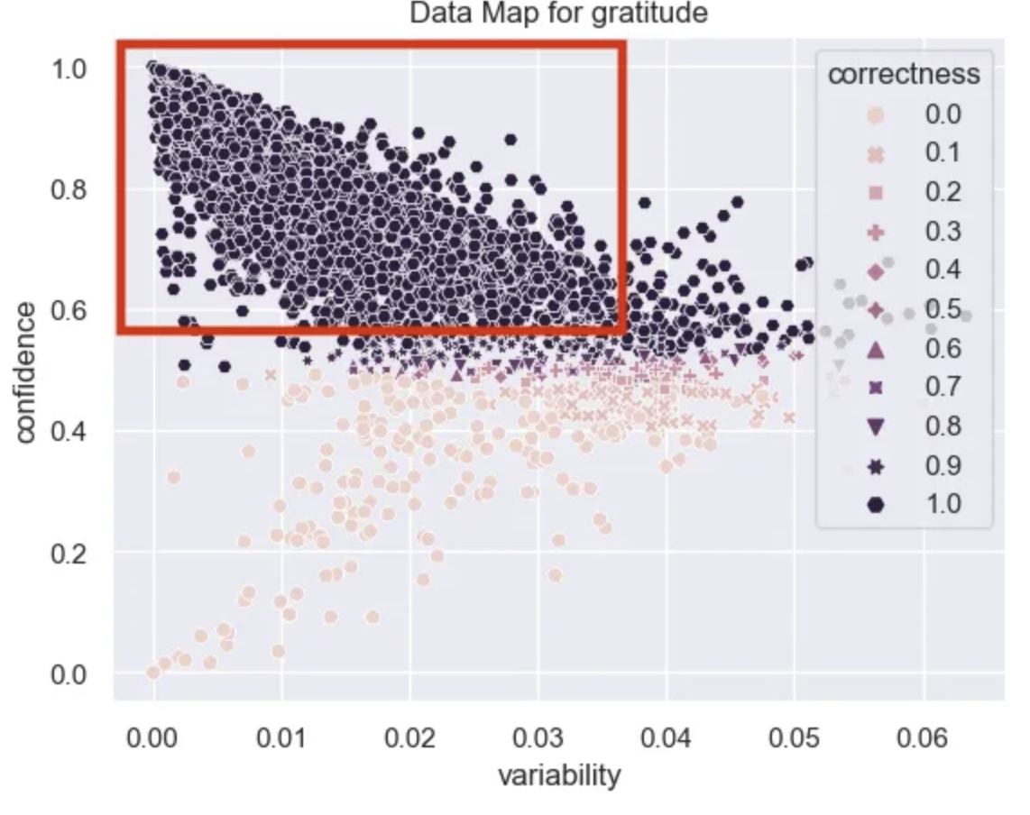
easy_df = data_map_df[(data_map_df["confidence"] > .6)]
easy_df.head(20)["text"].tolist()
Some examples of positive and negative easy points for the model to classify are:
‘Yes I heard abt the f bombs! That has to be why. Thanks for your reply:) until then hubby and I will anxiously wait 😝’
‘It might be linked to the trust factor of your friend.’
‘To make her feel threatened’
Ambiguous Examples
There aren’t many ambiguous examples in this dataset. These are usually the pinkish ones to the right with a lot of variability in their probabilities. Given that the variability in this dataset is so low it’s hard to conclude that we have many truly ambiguous examples, however, I’ve highlighted the region that these occur in the data map.
ambiguous_df = data_map_df.sort_values("variability", ascending=False).head(20)
ambiguous_df["text"].tolist()[:10]
‘Congrats dude! I hope my shitstuation turns around as greatly as yours did.’
‘Thanks! Definite props to him because he was pulling a double shift when we were at the capacity of campers.’
‘Well said.’
‘So glad I have a 20 minute walk to work up in the Bay Area.’,
Some of these feel obvious but I also see some clear sarcasm like the bay area description highlighting what might be a more complex case.
Hard Examples
Lastly we have the hard region, the place where data is not very confidence and is consistently incorrectly predicted. This area holds the examples that are really challenging for the model and is an excellent place to look for mislabeled data and also to get insights into why your current task is challenging.

hard_df = data_map_df[(data_map_df["confidence"] < .4)]
hard_df["text"].tolist()[:10]
As an autism mum, I can’t thank you enough.
I love this! Thanks for putting a smile on my face this morning.
Happy New Year!!
The top two here were labeled as not gratitude and the bottom was labeled as gratitude. It’s clear that some of these were mislabeled! Right out the gate we could identify some examples that were incorrect. I often try and go through my hard examples list to find potential candidates for mislabeling. Correcting these can usually improve performance of our models.
Parting Thoughts
As our ability to generate more and more realistic content improves, the value of synthetic data will as well. These techniques allow us to focus our efforts on data curation in areas that are ripe for model improvement. I think a key piece of improving our models in the future is really the quality of the data that we use and there is no better technique that I know of than this to rigorously interrogate your data. Best of luck, and let me know what amazing things you build with this.