Scatter Plots, Covariance, and Outliers
Introduction
In my last post I discussed some of the very basics of covariance. In this post I’m going to look briefly at visualizing the relationships between features, and one technique to remove outliers from the data to clean up these visualizations. Again, I will be using the abalone dataset found here. All analysis will be done in python.
The Scatter Plot and Covariance
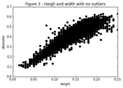
The scatter plot is one of the simplest charts and yet it is also one of the most informative. It has an exceptional ink to data ratio and is very intuitive for the use to understand. We can use these plots to understand how features behave in relationship to each other as well. In Figure 1 I’ve plotted a simple scatter plot of the abalone’s height and diameter.
points = abalone[["height", "diameter"]].as_matrix()
plt.plot(abalone["height"], abalone["diameter"], 'ok')
plt.xlabel("height")
plt.ylabel("diameter")
plt.title("Figure 1 - Abalone size comparison")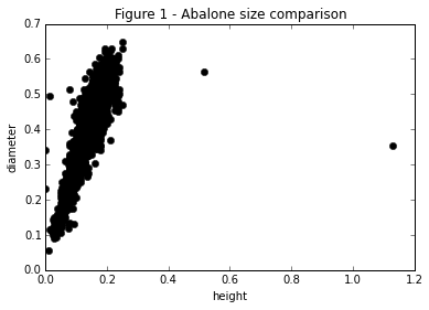
From Figure 1 we can see that the data falls on a fairly straight positive sloping line. We can interpret this as a positive correlation between the diameter of the abalone and it’s height. If we refer back to our work in the last post we see that this is indeed the observation! With a correlation of about .83. But This plot uncovers something interesting. Notice the outliers! We’ve just plotted the points of two of the features and already we are ucvoering something interesting in the data. There are a good number of points that are clearly extremal. This leads to the qustion, do extremal points affect the correlation between two features? Let’s find out! It is clear from the scatter plot that there are two points very far out of the spread. Take my word on it for now but these points are at index 2051 and 1417 in the dataset. If we remove them and recalculate correlation:
abalone.drop(abalone.index[[2051, 1417]])[names[1:]].corr()["height"][1]we get a new correlation of .906! This is a significant increase in our percieved relationship between these values, and all from removing just two points!
Identifying Outliers with the Convex Hull
This method works fine in two dimensions but what do we do if our data is 10 dimensional? We can’t visually identify these extremal points, and if we tried to it would take a very very long time to do. How might we determine what the outliers are in a data driven way? The technique that I will use here is removing all points from the convex hull of the data. I suppose this technique will require a minor digression.
For the mathematically inclined, the convex hull of a set \(C\) is the set of all convex combinations of poitns in \(C\)
\begin{align} \text{conv}[C] &= \{\theta_1x_1 + \cdots \theta_kx_k | x_i \in C, \theta_i \geq 0, i=1,…,k, \theta_1+…\theta_k = 1\} \end{align}
What this is basically saying is the convex hull is the smallest convex set that contains \(C\). An easy way yo thing about this is choose some set of points and then imagine a rubber band being stretched out and then allowed to collapse around all of the points. The area inside of the rubber band is the convex hull of the Set. We can use this idea to find the points that are on the boundary of our set and label them as outliers! This is super easy in python.
# Load in convex hull method
from scipy.spatial import ConvexHull

# Define the set of our points
points = abalone[["height", "diameter"]].as_matrix()

# Calculate the position of the points in the convex hull
hull = ConvexHull(points)

# Examine the points
print points[hull.vertices]

# Plot the convex hull over the scatter plot
plt.plot(abalone["height"], abalone["diameter"], 'ok')
plt.plot(points[hull.vertices, 0], points[hull.vertices,1], 'r--', lw = 2)
plt.plot(points[hull.vertices, 0], points[hull.vertices,1], 'ro', lw = 2)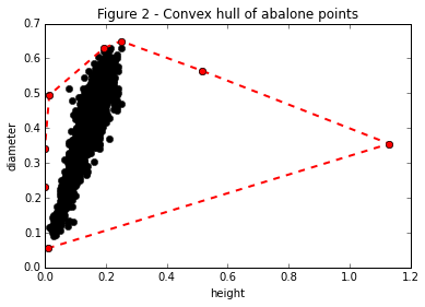
If we remove these points our scatter plot looks much cleaner!
plt.plot(np.delete(points[:,0], hull.vertices), np.delete(points[:,1], hull.vertices), 'ok')
plt.xlabel("height")
plt.ylabel("diameter")
plt.title("Figure 3 - Heigh and width with no outliers")